Rockefeller Center Artwork
Talin Kraft
On several occasions, I’ve heard negative opinions about Rockefeller Center ― apparently, where I see one of the most significant, interesting, and meaningful architectural complexes in New York, some people see “a bunch of concrete blocks”. So I’d like to counter that viewpoint with a story written on those blocks.
If you were a multi-millionaire in the beginning of 20st century in New York City, wishing to build a skyscraper, the first person you would hire was a philosopher. That’s because every skyscraper represented a certain idea ― it could be a celebration of a related industry (Chrysler, Singer), recent technological advancements (such as electricity and radio in GE Tower), or a more general concept (“New York as a new Babylon” in French Building). To better convey that theme, a philosopher, working together with artists and architects, was a central figure. In the Rockefeller center, the exterior ornament was done by philosophy professor H. B. Alexander in collaboration with my favorite Art Deco sculptor Lee Lawrie, who was dubbed “Michelangelo of a machine age”.
The central idea that Rockefeller Center is trying to convey is Humanity’s Progress. There are different aspects of it.
PROGRESS AS A CONCEPT
The progress of humankind began with the discovery of fire ― and this is why Prometheus is in the very center of Rockefeller Plaza. He is encircled by a zodiacal ring, which represents the whole world. Note how Prometheus holds fire in his bare hand – it’s not a torch, but flames, without a visible source of fire. This underscores divine nature of both fire and the fire holder. The Titan is flanked on either side by the smaller figures of “Youth” and “Maiden”, both symbolizing the young humankind, as progress is often associated with young age.
All three sculptures are the work of Paul Manship.
1 Rockefeller Plaza, formerly time-life building
Nearby (at the 1 Rock Plaza building) the Progress itself is depicted as a robed woman holding a branch in one hand, a pan of divine fire in the other, and accompanied by a black Pegasus representing poetic "Inspiration", and a brown eagle, representing "Aspiration". Gilded stars on the left symbolize divine guidance. There are two different accounts in regards to the branch. Rockefeller Center’s website claims it’s an olive branch, symbol of peace, while in the Landmark Preservation Commission’ of NYC designation report the branch is described as bay (symbol of Apollo, patron of civilized arts). Both symbols have some merit, though I prefer the bay, as it adds to the idea of innovation (also, the designation report, written in 1985, references original materials – notes by Lee Lawrie and H.B. Alexander).
There’s another aspect to progress besides creativity and motivation, and it’s hard work. We see a tribute to labor just around the corner, in two limestone reliefs, “Industry” and “Agriculture” by Carl Paul Jennewein.
And finally, as a result of all that hard work, we can reap the fruits of our labor, which is depicted in Attilio Piccirilli's relief "Joy of Life", where a young Bacchus, holding a grape bunch, is celebrating with a group of revelers on the other side of this building (it might be worth noting here that Attilio Piccirili’s nickname, given him by his dear friend Mayor La Guardia, was “Uncle Peach”).
Note that this building is the only one in the whole complex that was not associated with any specific interest as it had no single major tenant. It was not until later that Time-Life occupied several floors and gave its name to the building. So the decorations here are generic in character rather than celebrating a particular trade or a nation, as on the rest of the Rock buildings.
30 Rockefeller plaza, formerly RCA building
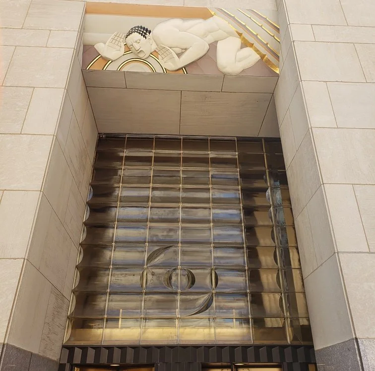
Some of the most important and beautiful artwork is placed at the central entrance of the main building. There are three high reliefs by Lee Lawrie - “Wisdom” in the center, flanked by “Sound” and “Light”.
In Lee Lawrie’s work, Wisdom is considered the creative power of the universe, and biblical quote adds even more authority. To quote the sculptor himself, “[t]he program shows Wisdom thrusting aside the clouds of ignorance and interpreting for man the laws and cycles of the cosmic universe, thereby ruling all of human activity.” It’s also worth noting that the image of "Wisdom" was heavily influenced by “The Ancient of Days”, the frontispiece to “Europe: A Prophecy” by William Blake. John D. Rockefeller Jr., the developer of Rockefeller Center, was not very happy with this choice - in his opinion, shaped by his classical education, Wisdom was traditionally portrayed as a female, Sophia. Furthermore, Blake’s Urizen (a mythological deity invented by Blake to personify reason and law) is a negative character, so the whole thing is quite controversial. Nevertheless, Lee Lawrie’s interpretation is clearly positive, powerful and simply beautiful, and even Rockefeller himself, despite the questionable symbolism, considered it “a source of great pleasure”.
Note how the “Sound” figure cups his hands as he transmits Wisdom through radio and telephone, as symbolized by the expanding circles through which sound travels. The circular sound waves are continued on the glass screen below. “Light”, on the right, spreads Wisdom by means of sight, motion pictures and television, and simultaneously symbolizes spiritual light as the swastika of life on the glass screen below is intended to indicate (remember, swastika at that time was not yet appropriated and corrupted by the Nazis).
There’s also another aspect to Wisdom image - symbolically, it’s Uranus. Note the unusual shape of Wisdom’s frown creases - it forms an astronomical sign for Uranus that resembles a letter ‘H’ (for William Herschel, an astronomer who discovered the planet). In astrological symbolism, Uranus represents progress, innovation, electricity and radio (fitting for RCA building), urbanism, futuristic ideas and new technology.
On a lighter note, I highly recommend taking a look around Lego Store at the Promenade. They have Lego replicas of the most prominent sculptures in Rockefeller Center, it’s very funny. I love how they changed the bible quote from “Wisdom and Knowledge shall be the stability of thy times” to “Creativity and Imagination…” on Wisdom installation.
RCA BUilding interior – american progress
The interior of the RCA Building consists of two sections: the entrance lobby off Rockefeller Plaza, and the connecting corridors and elevator banks, which create a grand concourse.
On the western wall of the entrance lobby, behind the information desk, rises Sert's mural of "American Progress." It depicts America 's development through the union of intelligence and strength. On the right are figures of Poetry, Music, and Dance looking upward for inspiration; on the left are men of action, represented by statues of labor. These two groups flank pictures of Ralfh Waldo Emerson, the philosopher and thinker, and Abraham Lincoln, as the man of action. In the center background are the t0wers of Rockefeller Center. This device of depicting the building in lobby art was a favorite with designers of the period, being used in both the Chrysler Building and the Empire State Building.
Sert's mural of "Time" spreads out over the entire entrance lobby ceiling. Three figures, representing Past, Present, and Future, are shown with their feet resting on the tops of the piers. Hour glasses, held by the figures of Past and Future, are being placed on the scales held by the figure of Present. The airplanes in flight are to indicate man’s partial conquest of time and space.
Sert's first four murals for the RCA Building may be seen on the four elevator banks facing the north corridor. In order they are: "The abolition of pain and labor of former ages by the creative intelligence of the machine," with human figures and oxen pulling a heavy load with a railroad engine in the background; "The conquests of the pests and epidemics of yesteryear by scientific invention," with figures lined up waiting to received inoculations; "The stamping out of tyranny and slavery," with figures of slaves pushing enormous blocks of stone; and "The suppression of war through the combined faculties of man applied to the quest of human happiness," dominated by figures grouped around and emerging from giant cannons. The whole series is called “The Triumphs of Mankind Expressed”.
Additional works of Sert are “Man' s triumph in communications”, which is represented by figures hoisting a globe up over scaffolding depicting radio, telephone, and telegraph - on the south wall of the first elevator rank, and figures representing “The Spirit of the Dance” on the north wall of the first elevator rank.
Adorning the staircases are additional Sert murals: "Contest-1940" with figures of the five races of mankind using the world as a football to compete for global supremacy, at the north, and "Fraternity of Men" with the figures of the five races clasping their hands in brotherhood, at the south.
1250 sixth Avenue, formerly rca building west
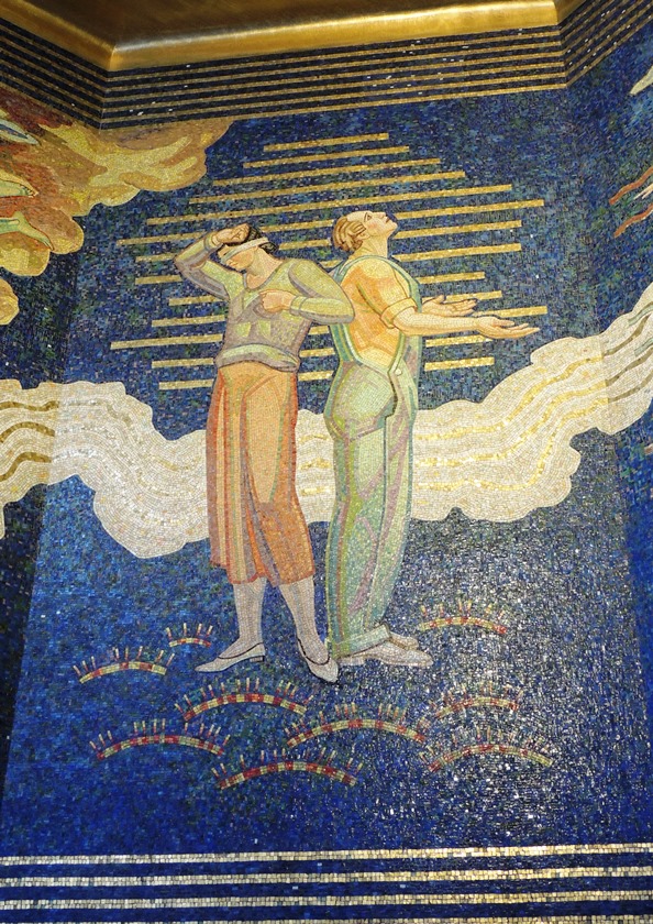
On the 6th ave loggia brilliant mosaic (“Intelligence Awakening Mankind”), the Progress is represented by a central figure of Thought, flanked by her articulate manifestations: the female image of Spoken Word and male Written Word with a book and quill in his hands (in current times, the genders pairing seems a bit sexist). Emanating from the central trio are extensions of intelligence – personifications of various sciences, arts and social changes, flying towards humankind, represented by two couples. Here, again, a lyre-bearing female is surrounded mostly by arts and Religion, and a winged male holding a light is followed by sciences, Publicity, and, oddly enough, by Sports and Hygiene. Human couples’ reaction to progressive ideas is not uniform, though: while a couple on the right welcomes the beneficial spirits with open arms, the couple on the left is split. The man seems to be enamored with the spirits, but the blindfolded woman turned away and is not ready to embrace the progressive ideas. Again, a female is portrayed as lagging behind a more advanced male.
On the sides, man’s evil enemies of Ignorance, Cruelty, Fear and Poverty go down in flames, being destroyed by Knowledge.
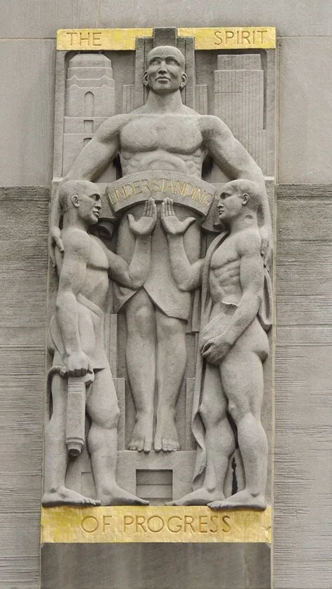
Above the entrance are four limestone panels (“Aspects of Mankind”) by the sculptor Gaston Lachaise. Each allegorical theme was intended to express the purpose of the building as well as various aspects of modern civilization. At left Genius Seizing the light of the Sun is represented by a monumental central "Genius", who directs the sun's gilded rays through a glass for use as fire and electricity. Next is The Conquest of Space where a trio amid Saturn and gilded stars suggests astronomical and physical science. Gifts of Earth to Mankind occupies the right center position. It shows the monumental figure of Mother Earth offering gilded grain to a human family against a ground of gilded astrological symbols. At the far right is The Spirit of Progress where the monumental figure of "Capital" helps the smaller figures of "Labor" to support a banner with the gilded inscription: "UNDERSTANDING."
CELEBRATION OF INDUSTRY
Radio and Television
30 ROCKEFELLER PLAZA, FORMERLY RCA BUILDING
The “Sound” and “Light” high reliefs on the façade serve as the primal forces for Radio and Television industries, but there are also two additional, more elaborate sculptural groups on the north and south sides of the building. These groups try to spell out the principles of radio and television technology, and it’s hilarious.
In both Radio and Television works, transmission plays a central role.
Radio: the larger figure represents transmission, who sends the song of the figures on the left (broadcasting) to those on the right. Mother Earth and her child represent the audience receiving the sounds of the radio.
Television: the image of the dancing figures on the left is being sent by the larger figure (transmission) to the standing figure (reception) on the right, who, in turn, then presents this image to the seated figures, or the audience.
1230 sixth Avenue, demolished center theatre
The Center Theatre was the only building in the original Rockefeller complex that got demolished. It occupied the southeast corner of West 49th Street and 6th Ave. Nearby, there’s a tribute to a polychromed plague decorating its façade once.
“Radio and Television Encompassing the Earth” by Hildreth Meiere. This 1988 cast bas-relief is based upon an original 1932 watercolor study by the artist.
1270 sixth Avenue, former RKO building
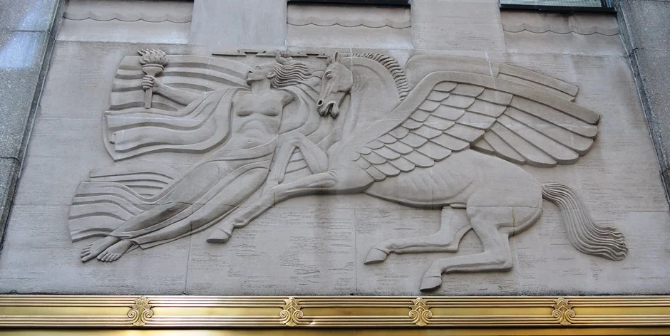
Robert Garrison’s “Morning, Present Time, Evening” three limestone panels over the 6th ave entrance of RKO building are allegories of time and the importance of radio communication in promoting culture (“Radio spreading the Inspiration of the Past and Present”). The central panel shows the female muse of Contemporary Thought holding the torch of past knowledge in one hand and in the other, an electric bolt signifying the speed of radio transmission and the force that accomplishes it. To her right is a rearing Pegasus, the winged horse of inspiration. Rushing toward the central panel are symbols of radio's endless activity. On the right, virile Morning flies entwined in the wings of an eagle. Evening at left is borne atop a flying goose (by the way, the goose is a sacred bird of Aphrodite, so you can take this panel as an allegory of using radio for romantic and sentimental purposes).
Transport
10 Rockefeller Plaza, formerly Eastern Airlines / Holland house
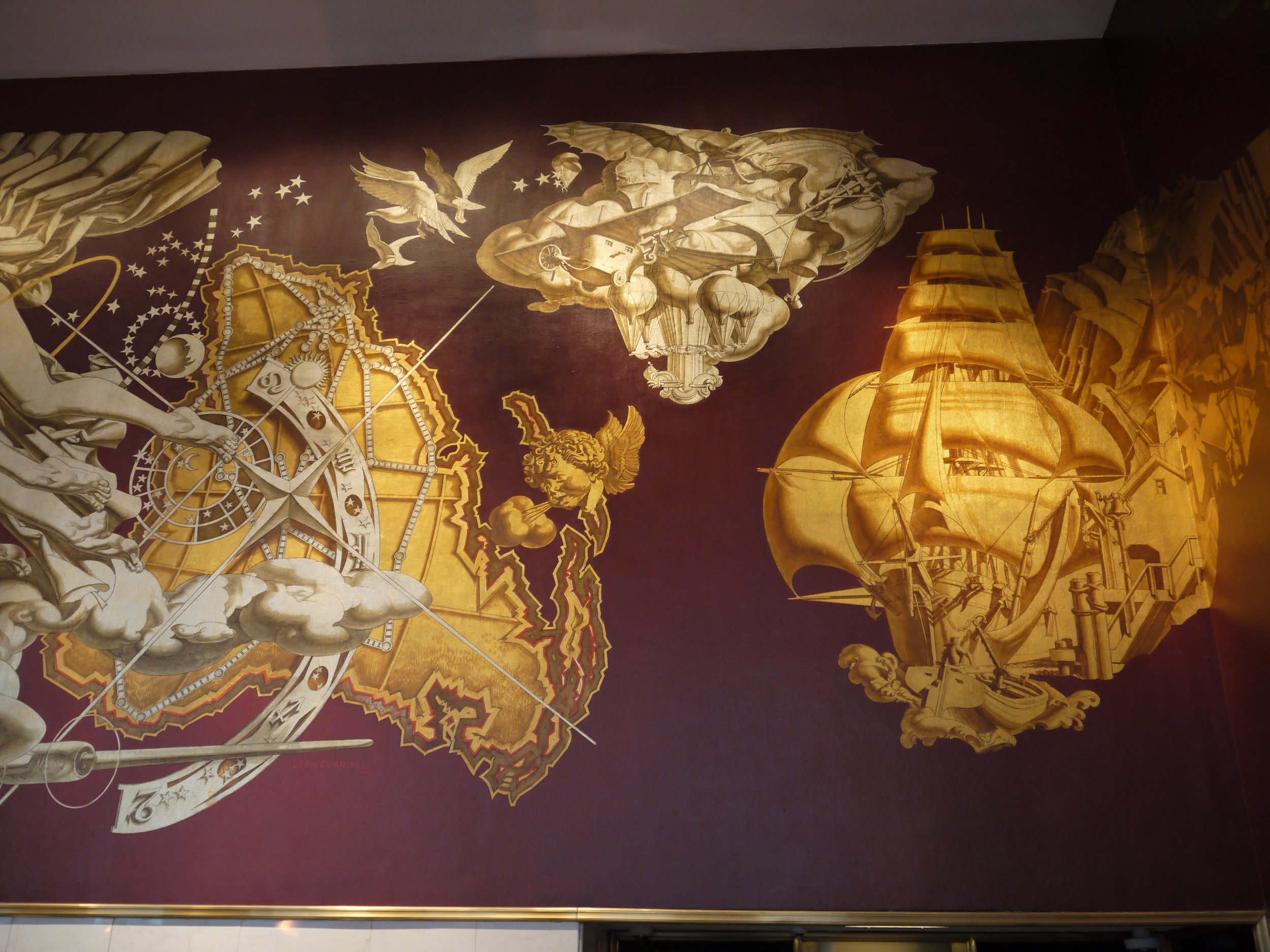
“The History of Transportation” by Dean Cromwell
Eastern Airlines CEO Eddie Rickenbacker is portrayed here in a race car (in the last photo).
Theater
Radio City music Hall
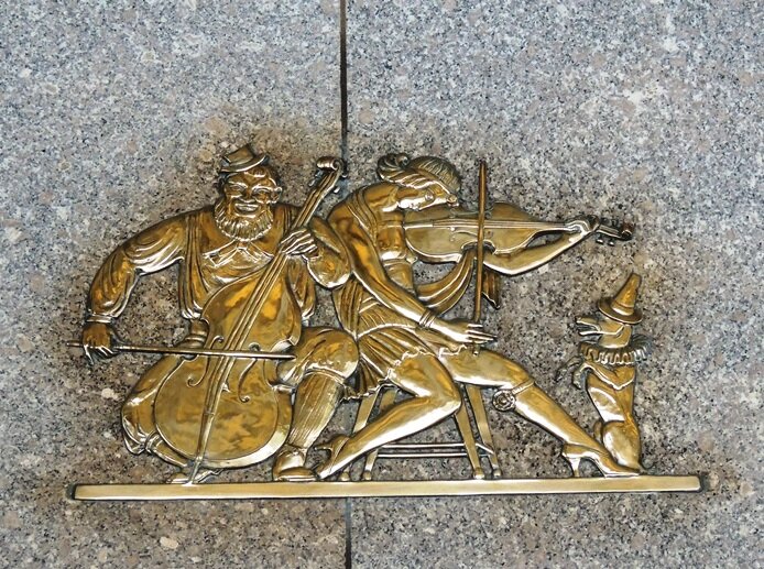
“Acts From Vaudeville” by Rene Paul Chambellan
The more popular entertainments of the Music Hall were represented by six bronze plaques over the entrance and side of the theater's vestibule on Sixth Avenue. The series was designed by Rene Chambellan and is closely related to that which he executed for the doors of the Grand Foyer on the theater's interior. The series shows scenes from international vaudeville acts. Reading from left to right are five Russian minstrels who accompany a gypsy dancer, two Black banjo players and a tap dancer, a seated German accordionist and saxophonist who play as a patient cat listens, five American precision dancers (the "Roxyettes"), an old French cellist and female violinist who play as a dog (in clown costume) sits upright, and finally a seated Jewish drummer with a tuxedo clad singer/dancer.
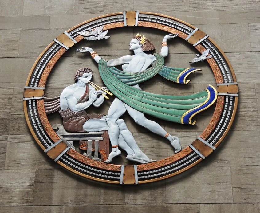
The more sophisticated stage arts were depicted in a classically–inspired series of metal and enamel plaques installed above West 50th Street on the Music Hall's south facade. Designed by Hildreth Meiere and executed by Oscar Bach, these plaques represent a major technical achievement. Although polychromed metals had been used before, mostly in Europe, they were largely ignored by American artists. Meiere not only introduced the technique, but did so at unprecedented scale. She drew on her skill as a painter and mosaicist to brilliantly enliven the Music Hall's wall and achieved, in the words of a Rockefeller Center spokesman, "a striking relief from the usual severe surfaces of theater buildings."
Press
50 Rockefeller plaza, formerly Associated Press
In January 1938 a competition was announced for the design of a bronze panel for the Associated Press Building's entrance. Of the 188 proposals submitted, two were entered by Isamu Noguchi. He worked on one for two months, the other for three days. The latter won. (The medium of the artist's choice, however, was stainless steel).
“News” by Isamu Noguchi is a 10–ton high relief paying tribute to the men who gather, edit and distribute the news. Five figures are portrayed with the tools of their trade (some of those are not recognizable now): a telephone, reporter's pencil and notebook, camera, wirephoto and teletype. Stretching diagonally behind the group are the wires which transmit A.P.'s news worldwide.
THE WORLD EMPIRES
Another aspect of mankind’s progress is the history of biggest civilizations. Three greatest contemporary empires were chosen ― Great Britain, France, and Italy, and there’s a building for each one. There are actually four buildings, and the fourth one was supposed to be dedicated to Germany at some point, then to Russia and finally, they decided to make it “International”. Also, before 10 Rockefeller Plaza building became an Eastern Airlines headquarters, it was supposed to be a “Holland House”. Realization of Dutch occupancy was cut short, however, by Hitler's invasion of the Netherlands. 10 Rockefeller Plaza served as the temporary offices of the government-in-exile.
Each of the foreign tenants used its building to express the cultural attributes of her own country. Every building’s decorations follow the same schema ― the grand panel over the central entrance on the Fifth Avenue facade, a cartouche over the panel, four limestone reliefs, carved into the spandrels above the sixth story windows, and some symbolic figures on the side entrances of the building. Let’s take a look.
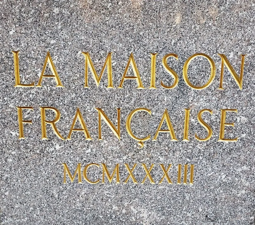
La Maison Francaise
French building’ main message is a celebration of culture, artistic legacy, and brotherhood at Rockefeller Center. These themes are especially articulate in the 10-ton bronze panel by a French sculptor Alfred Janniot.
Installed above the building's triple doors, the panel depicts France and New York joining hands across the sea. The former is sitting atop a great sailing ship, representing the old world. She holds Notre Dame in her lap as a scroll inscribed with the motto of Paris ― "Fluctuat nec Mergitur" ("It floats but never sinks") ― furls behind. New York, by contrast, is perched on the deck of a modern ocean liner, a banderole bearing the city's name swirling before the modern skyline (a new world). The three female figures below represent three Graces: "Poesie," "Beaute" and "Elegance" — the cultural exchange between the two nations. Poesie is perched on the wings of Pegasus (whose neck bears the inscription "Alfred Janniot Sculpteur") while her mates stand among the birds and trees of the two continents.
Above the panel, polychromed cartouche by the same sculptor features massive female figure holding the torch of freedom as she proclaims Liberte, Egalite, Fraternite (Liberty, Equality, Fraternity) to the world.
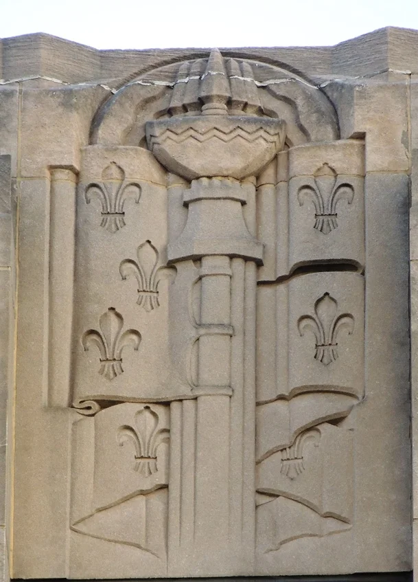
Lee Lawrie designed the decorations for the side entrances of La Maison Francaise. Over its southern portal are three incised and gilded fleur-de-lys, continuing the stylization of the Royal French lily which had begun in the Middle Ages.
Gilded fleurs-de-lys appear again on the northern entrance to La Maison Francaise where Lawrie cleverly used them as the "seeds of good citizenship" sown by a gilded woman in a Phrygian cap, symbol of freedom.
Four limestone reliefs on the top of French Building by Rene Paul Chambellan represent the Pageant of French History.
The first relief depicts the rise of Charlemagne’s Empire where society and religion were subordinated to, and protected by, military power (symbolized by a huge sword). Early influences on France are represented by the Roman insignia (a Roman Eagle and the letters S.P.Q.R., an abbreviation for “The Senate and the People of Rome”), the Celtic bard's harp and Gallic cock, symbol of France as a nation.
The second spandrel symbolizes the nation's formative period. Clustered spears in the fleur-de-lys banner of New France signify unity. A chalice denotes the spirit of chivalry and self-sacrifice; a halo, the spiritual state of mind.
The third spandrel shows Absolute Monarchy under Louis XIV with a crowned sceptre, two fleur-de-lys shields and a banner inscribed with the Sun King's motto “L'état, C'est Moi” ("I am the state").
In the final spandrel the French Republic is represented by the letters "R.F" on either side of a Phrygian cap (signifying freedom) atop bundled fasces (for unity) and the laurel wreath (victory). Below, the motto of the French Republic “Liberty, Equality, Fraternity” is inscribed in three bands.
French building used to house the French Consulate, and to this day, there are still a few French brand stores.
The British empire
Great Britain' s themes were the empire, her natural resources and commerce.
The theme of imperial commerce was prominent on the bronze panel depicting the diverse peoples and industries of the British Empire (designed by C. Paul Jennewein, a German-born American sculptor).
Included in various positions are the major industries of the British Isles, each standing upon a pedestal. Among them are British fisherman and coal miner, with appropriate attributes. The commerce of India appears as a man holding sugar cane stalks, a woman carrying a bag of salt and another beside a leafy tobacco plant. Canada is represented by a reaper, Australia by a shepherd with a sheep and Africa by a black woman amid cotton plants. At the bottom center of the composition, just above the middle door, is a radiating sun, symbolic of the empire on which "the sun never sets", and a figure of seaman (the only one without an industry name), central to commerce and empire’s success.
Depictions of Great Britain's authority likewise appear above the north and south entrances where Lee Lawrie created symbols of the "power arising from imperial influence and the respect commanded by the nation." For the northern lintel he designed three gilded passant-gardant lions, a modern representation of the Arms of England (an image first used on the shield of Richard the Lionheart in XII century). Below is a series of stylized red Lancaster roses.
For the southern entrance to the building, Lawrie chose Winged Mercury, the wing-footed god of commerce, to represent the merchant marine which was so important for the establishment of Britain's might. The gilded figure is propelled along a blue wave-crested lintel. Above him is the radiating sun of the empire.
The imperial theme continues in four limestone reliefs by Rene Paul Chambellan. These panels represent the coats of arms of the four historical subdivisions of the British Empire. Reading from left to right are the Dragon and heraldic ostrich plumes of Wales, England's Lion and double Tudor rose, Scotland's Unicorn and Thistle, and finally, the Stag, Harp and Shamrock of Ireland.
Channel Gardens
As the Channel separates Britain and France, the Channel Gardens separate Rockefeller Center's British and French buildings. The Gardens form a promenade that leads to the Center's sunken plaza. The Gardens consist of several large rectangular planters, seasonally planted, with a pool in the middle of each planter.
For the eastern end of the pools Rene Chambellan designed a variety of bronze fish fountainheads, each ridden by a Triton or Nereid. Under the influence of the theme-orchestrating Professor Alexander, they were made to symbolize the attributes which have fostered human progress. Reading from Fifth Avenue down to the sunken Plaza, are a Triton blowing into a conch shell (symbolizing Leadership), followed by Will, Thought, Imagination, Energy, and Alertness. Even if you try, you can’t tell them apart. In the western ends of the pools are small bronze drainheads which are decorated with sea creatures such as an octopus, crab, and turtle, but they don’t have any special meaning.
Palazzo D’Italia
The Palazzo d’Italia has a really interesting history. It was a reflection of the prevailing time and regime. The architectural plans for this building were presented to Benito Mussolini, who was pleased with it. (More on Mussolini influence in the Atlas section). The overall theme of the building is heavily influenced by Fascist iconography.
The four panels designed by Leo Lentelli for the top of the building symbolize the four ages of Italian greatness: the Roman Empire (represented by a laurel wreath, crown and military uniform with "SPQR" – “the Senate and People of Rome” – inscribed below); the Renaissance (where a roaring lion head between two helmets surmounts a shield bearing the tools of the painter, sculptor and architect. Below is a banderol inscribed "MCCCC", or 1400 ); Italian Unification of 1870 (shown by grouped flags surmounted by a shining star and inscribed below with two panels reading "Morte o Liberta", “Death or Freedom”) and finally, the Fascist Regime. The latter portrays a wing-spread eagle above the Fascist fasces, rods, and axes. Originally the panel carried the large inscription "AXII" (a reference to Mussolini's August 12, 1922 march on Rome) but this was effaced in 1949.
The grand entrance panel and the cartouche over it were removed during the War as they were inspired by Fascist iconography. The current entrance panel by Giacomo Manzu was installed much later in 1965 and is very different in style from the rest of the decor. The cartouche, which contained the crown of the ruling house of Savoy and the Fascist emblem, was never replaced.
The removed grand panel was one of a pair of multi-pane Corning glass panels executed by Attilio Piccirilli (the other being above the main entrance to the International Building next door, very similar in style but not as conspicuous and without inscriptions). It portrayed a muscled worker tilling the land with his spade. An inscription above proclaimed "Sempre Avanti, Eterna Giovinezza" (Advance Forever, Eternal Youth"). The figure was flanked by the vertical inscription "Arte e Lavoro ... La voro e Arte" ("Art is Labor ... Labor is Art"). The pair of these panels makes a lot of sense grouped together, as the laborer on the first panel clears a path for the “eternal youth” advancing on the second panel.
There’s an interesting choice of side entrance decoration for Italian building. It’s a bas-relief of St. Francis of Assisi, a somewhat puzzling appearance of a humble barefoot monk advocating poverty as a decoration for a new fashionable building with imperial overtones, dedicated to commerce. The overall mood of the Palazzo iconography was heroic, powerful, young, and aggressive. It made Lee Lawrie change his plans for a carving over the West 50th Street entrance. This is how he explains his choice:
“An ancient war galley would be the appropriate symbol, but I should like to do just the opposite thing – a St. Francis of Assisi feeding birds… Although it may seem incongruous in the light of present events, it is a symbol of Italy that connotes Giotto, Dante, and all of the humanities”.
The figure of Patron saint of Italy, Saint Francis of Assisi with birds by Lee Lawrie is an embodiment of humility, care, simple and gentle living. It’s also worth noting that Lee Lawrie, of German descent and born in Germany, was a single voice against glorification of Fascist symbols. I also feel a bit inadequate as to Lee Lawrie expected us to think of Giotto and Dante and great Italian culture in general when we see his St. Francis, and I think we’re failing miserably. Here’s Giotto’s famous painting so you don’t have to google it, and as for Dante, he dedicated a whole chapter (Paradiso 11) to St. Francis in the Divine Comedy.
When the time came to replace the forbidden art, the pendulum of an acceptable image of Italy swung too far to the other side. Ignoring the immense Italy’s contribution to the world culture, ignoring a vast influence of the Roman Empire, ignoring great Italian artists, poets, scientists, explorers, musicians and opera singers, the sculptor chose to tell the story of Italian immigration to the US.
The replacement panel by Giacomo Manzu is a high relief of wheat stalks entwined in a wishbone pattern with grapevines. The symbol, the sculptor explained, represented the immigrants' search for "the two principal things – eating and drinking." Under the grand panel he also installed a smaller bas-relief depicting an immigrant mother and her child, all their possessions in one small bundle. Together, they were making sense and telling the story of immigration, but later on the smaller panel was moved from Fifth Ave to the corner wall of a side entrance on the West 50th St., where it is now. To be honest, it’s pretty ugly and roughly executed and I understand the desire to move it away from its prominent position, but in its current location the message is completely lost. And without the smaller piece, the grand panel became a celebration of wine and pasta. Which, I suppose, is still better than celebration of Fascist imagery.
International Building
The Palazzo was to have been twinned with a strong and joyful Deutsche Haus. Negotiations between New York and Berlin continued into 1934, by which time the Nazis had come to power and begun to reshape German cultural life — including its architecture — in their own image. The Rockefellers recoiled from Hitler, and the Deutsche Haus was abandoned.
The internationalist scheme was both an effort to attract tenants with connections to the honored countries, and celebrate the internationalism that John D. Rockefeller, Jr., believed was the key to world peace. Originally there were some consulates located in the building, Customs bureau, travel agencies, and a US passport office.
The grand entrance here symbolically depicts the new vision and leadership of youth in world affairs. The heroic style and a symbolism of youth is a typical fascist theme of the 1930s: a new world order.
Youth Leading Industry, cast Pyrex glass grand entrance panel, and Commerce and Industry with a Caduceus, polychromed limestone cartouche over the panel, both by Attilio Piccirilli.
After the collapse of negotiations with Germany, occupancy of the northern block was contemplated by the Soviet Union before ultimate tenancy by various foreign clients and its christening as the "International Building North." A clear indication of its new purpose is seen in the four limestone reliefs which Leo Lentelli designed above the building's top story windows.
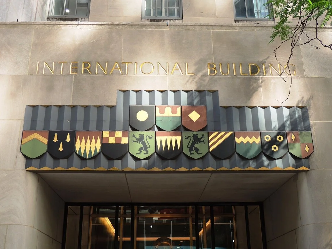
The spirit of international cooperation is evident on the building's side street entrances. Above the West 51st Street portal, Lee Lawrie designed a lintel with 14 polychromed coats of arms, arranged three over eleven. Disappointingly, these coats of arms don’t belong to any of the real nations as they are completely fake and don’t even follow basic rule of heraldry (“the rule of tincture”). Or, maybe, they purposefully serve as a mere abstraction of alliance without having to represent specific nations.
Cornucopia of Plenty stone carving portrays a female figure emerging from the clouds to distribute contents of an overflowing cornucopia. Lee Lawrie wrote that it symbolizes “the plentitude that would result from well-organized international trade”.
Rockefeller's theme of world peace was discreetly (and more personally, as Rockefellers were religious) displayed above the West 50th Street entrance, where a gilded plow and crossed swords (Swords Into Plowshares) float above the doorway. The simplicity and small size of this incised relief contrasts profoundly with its message. Inscribed simply "Isaiah II IV," it recalls the Biblical passage: "And He shall judge among the nations and shall rebuke many people; and they shall beat their swords into plowshares, and their spears into pruning hooks; nation shall not lift sword against nation, neither shall they learn war anymore."
Just under Swords Into Plowshares the theme of global cooperation is continued on two panels which portray America's hospitality to the world. On the street-facing panel (Columbia greeting a Woman), a female passenger debarks a ship and is greeted by Columbia, the feminine symbol of America. The passenger wears a stylized ancient helmet, symbolizing the old world, while Columbia has a Phrygian cap (soft felt cap that came to signify freedom during the French Revolution). The twin spires of St. Patrick's Cathedral, skyscrapers, and a section of the Brooklyn Bridge form part of New York's skyline in the background. The ship's prow rises at the left corner and cleverly merges into adjacent panel (Boatman unfurling a sail), that features a sailor standing on a ship and working with a sail; the ship is the means of trade and global cooperation.
Columbia greeting a Woman and Boatman unfurling a sail, both by Lee Lawrie
The Story of Mankind is a massive carved limestone screen (designed for backlighting) divided into fifteen small rectangular spaces that Lee Lawrie termed “hieroglyphs”. It was created to symbolize the purpose of the International Building (quest for world peace through global commerce) and to chronicle mankind’s progress and the history of ancient and modern internationalism, starting with the bottom center’s four figures depicting the races of mankind. The sailing ship above them symbolizes international trade, and above the ship are three male representations of art, science and industry (cultural attributes which promote higher civilization) and the reclining figure of Mercury as worldwide communication and a god of commerce.
Shining down upon him are the gilded rays of the sun, the face of which consists of a functioning stone clock. The two hemispheres are represented by the Big Dipper at top left and the Southern Cross (top right). Man's four habitats are represented by a seagull and whale fluke (north) , palm trees (south), an Aztec temple (west) and an eastern mosque. To the right of the ship is a Norman tower and lion (symbols of ancient authority), contrasting at left with symbols of the modern age: a factory with smoke stacks and a republican eagle.
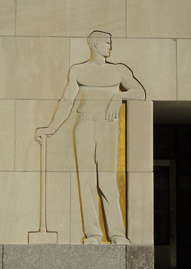
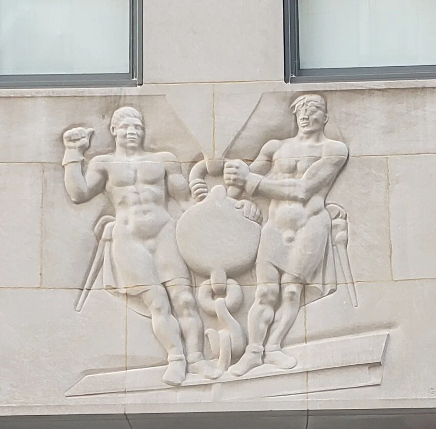
And finally, on the western facade, above 45 Rockefeller Plaza Entrance, there are two bas-reliefs by Gaston Lachaise to commemorate the Workmen of the Center. Commissioned as a tribute to labor, these sculptures depict the workers as muscular, heroic male figures, idealizing both manual labor and supreme physical beings.
Atlas
Atlas was designed by Lee Lawrie (with the assistance of Rene Chambellan) as a companion piece to his mythological brother, Prometheus, and like him is surrounded by zodiacal signs. For astronomical points, Lee Lawrie might have consulted his son and technical adviser, Milton Lawrie, a registered architect and passionate amateur astronomer. The axis of the sphere points to the north star; the whole is said to be in correct relationship to the solar system. Also, note symbols of the planets across Atlas’ yoke – there are Mercury through Neptune, but no Pluto, and no room for a ninth planet. The sculpture was designed in 1920, before Pluto was discovered (in 1930), and now is accurate again, after Pluto was kicked out of the planetary roster.
Apart from it being a great sculpture, it also caused a bit of a scandal as it’s basically a portrait of Benito Mussolini, who was quite a fashionable figure at some point, before people figured out that fascism is rather horrible. Take a look at this old photo of Mussolini and a closer look at the Atlas’ face.
And, last but not least, do not miss all the gorgeous details and decorations around Rockefeller complex. Rene Paul Chambellan did most of the architectural details – screens, handrails and moldings. Everywhere – from lintels to tree grilles, from vent covers to clocks – the attention to detail is meticulous.


